A restaurant’s table linens—tablecloths, napkins, and placemats—do more than protect surfaces; they shape guest perceptions through color psychology. Choosing the right hues can enhance dining experiences, influence moods, and reinforce brand identity. Here’s how strategic color selection can elevate your restaurant’s ambiance:
1. Warm Tones (Reds, Oranges, Yellows)
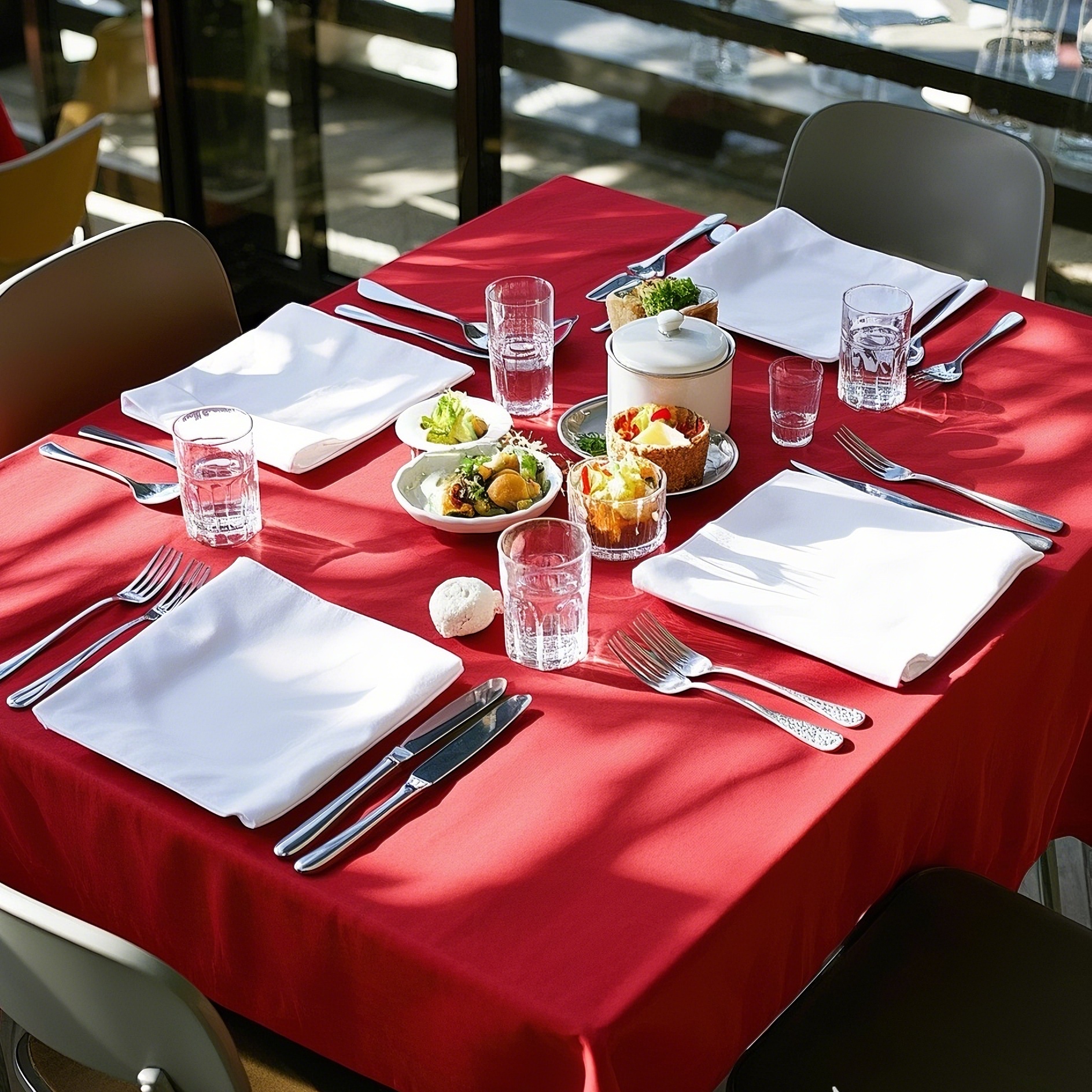
Red: Stimulates appetite and energy, ideal for fast-casual or bold cuisine. Pair with white napkins for balance.
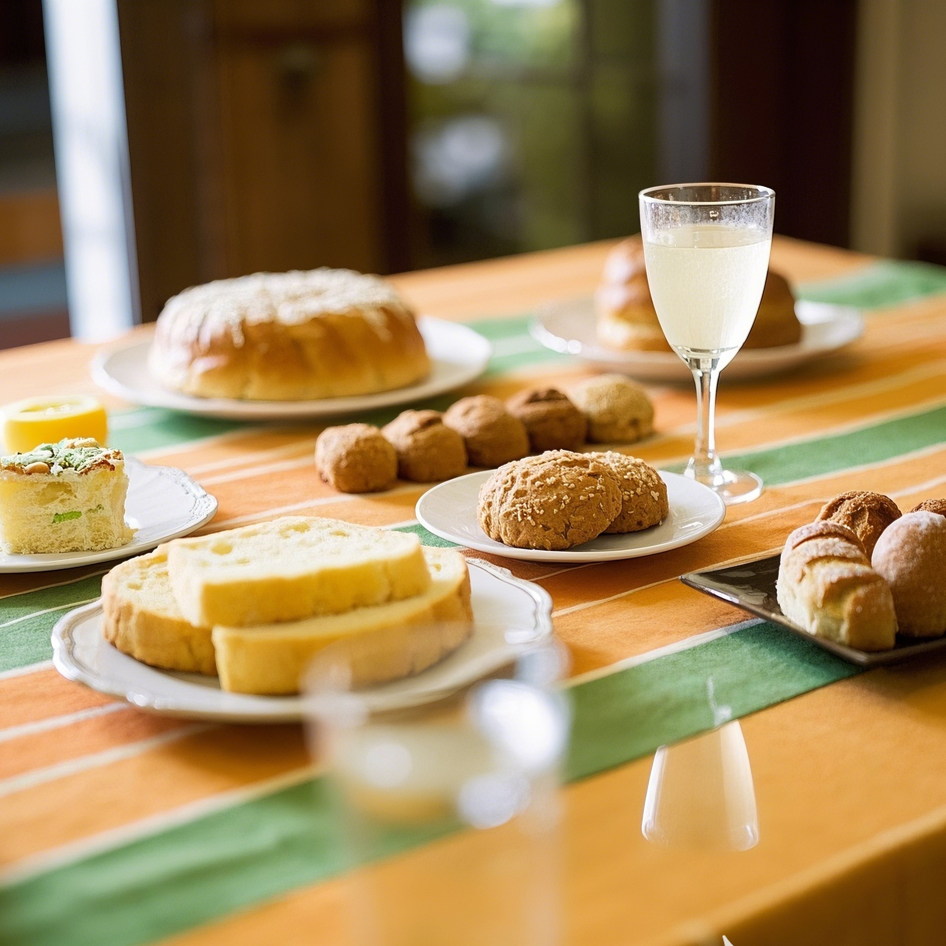
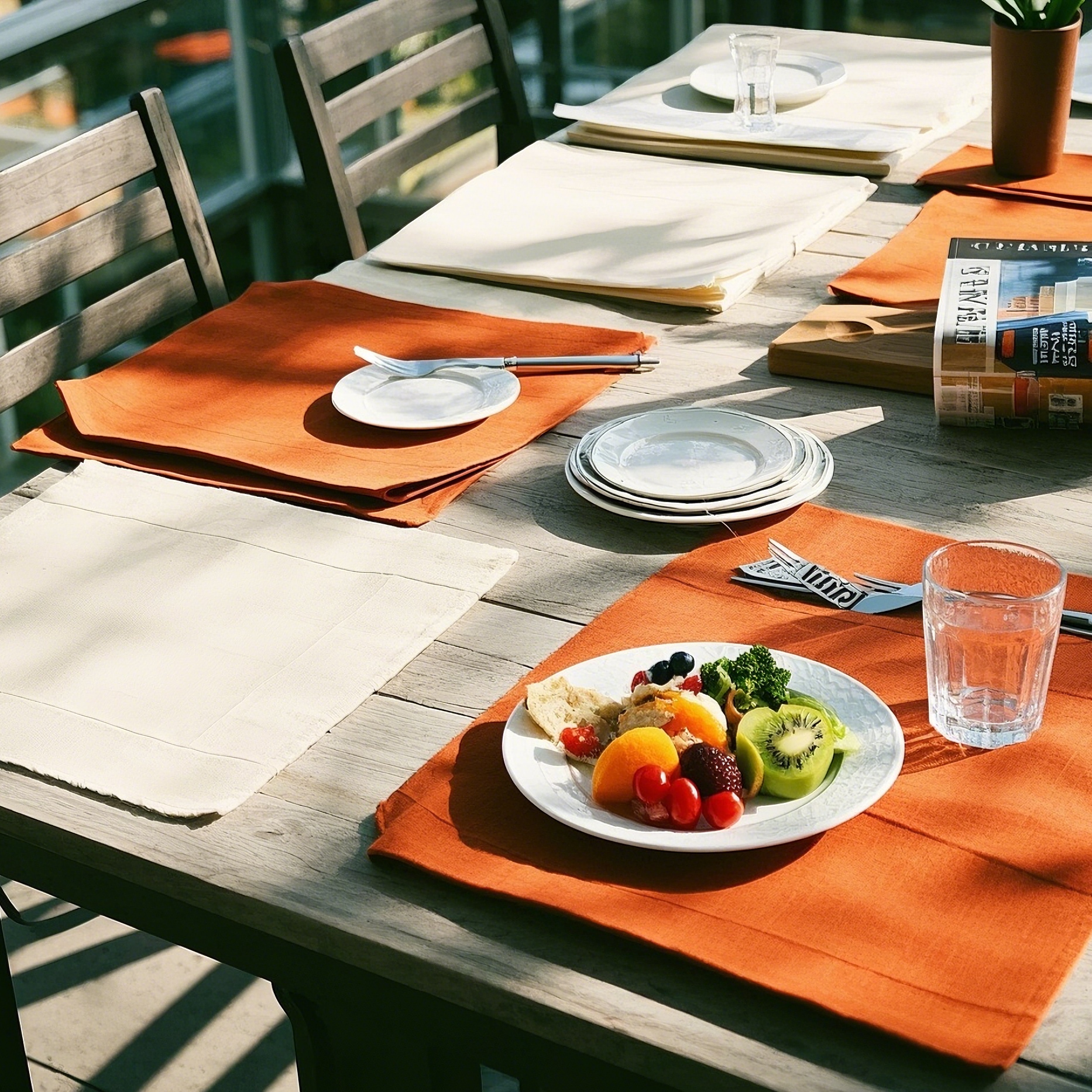
Orange: Friendly and inviting, perfect for family-style dining. Complements wooden tables well.
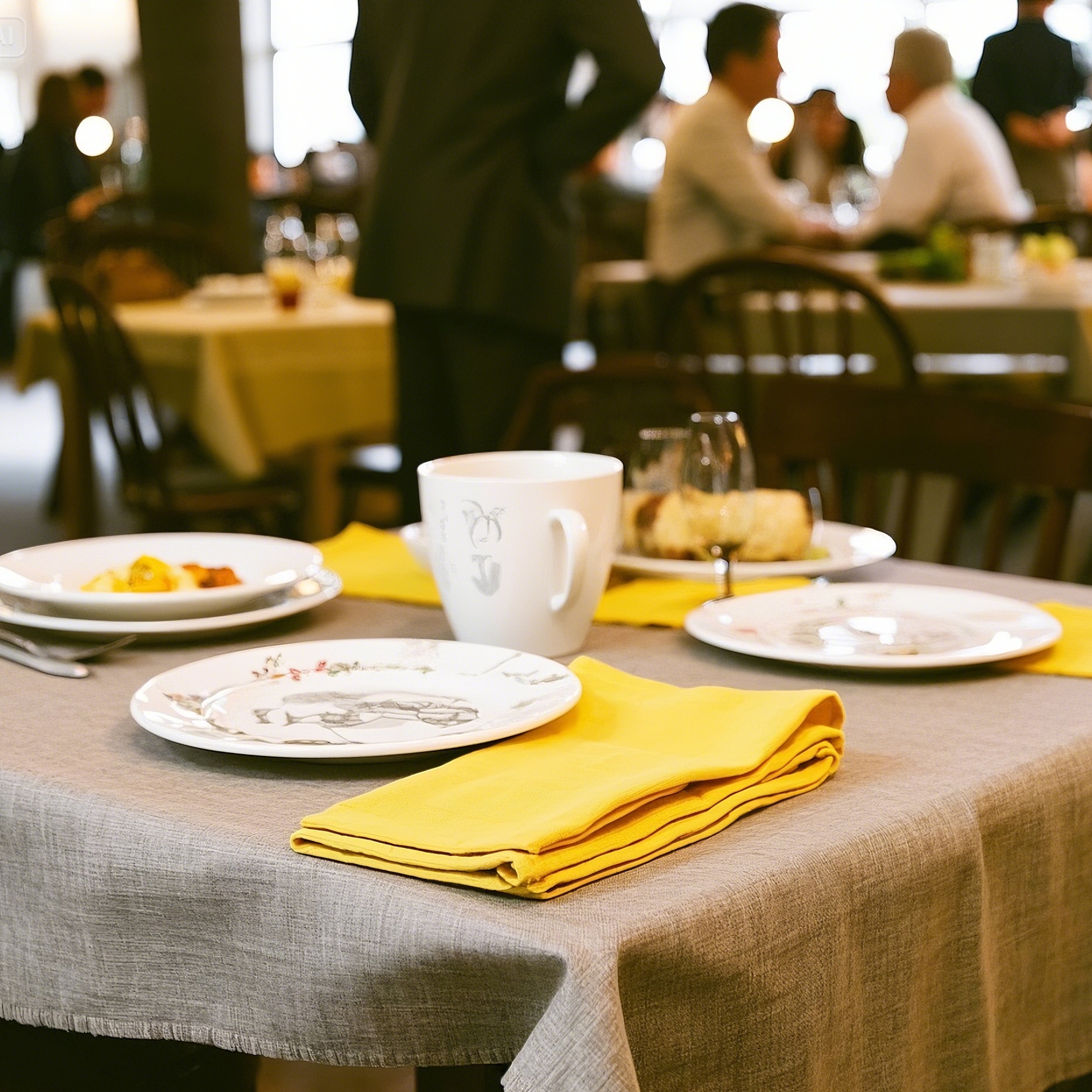
Yellow: Evokes happiness and warmth; best in daylight settings.
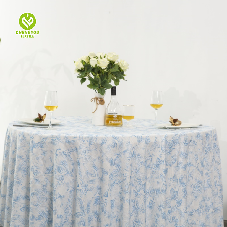
2. Cool Tones (Blues, Greens, Purples)
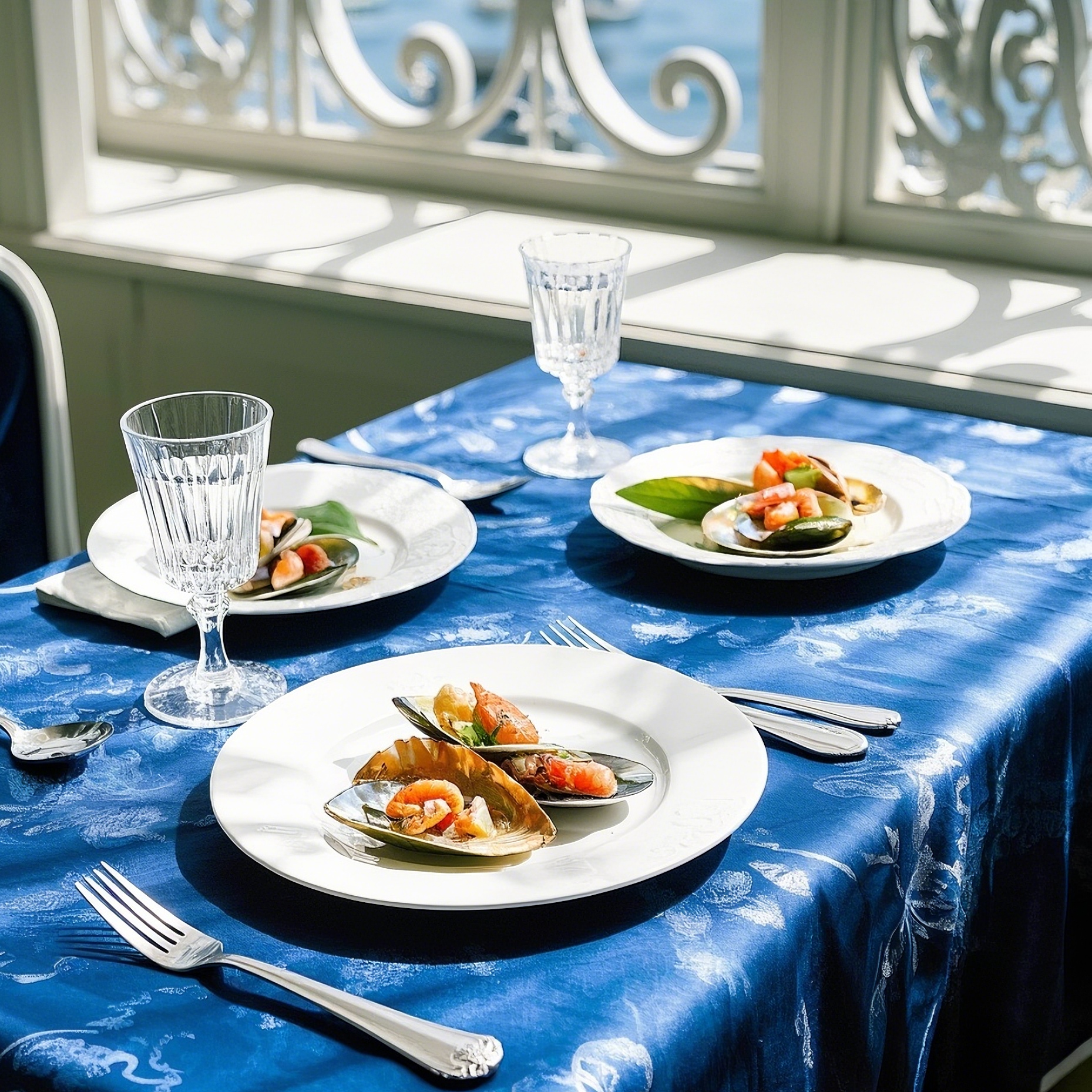
Blue: Promotes calm and trust; suited for seafood or upscale venues. Darker shades convey sophistication.
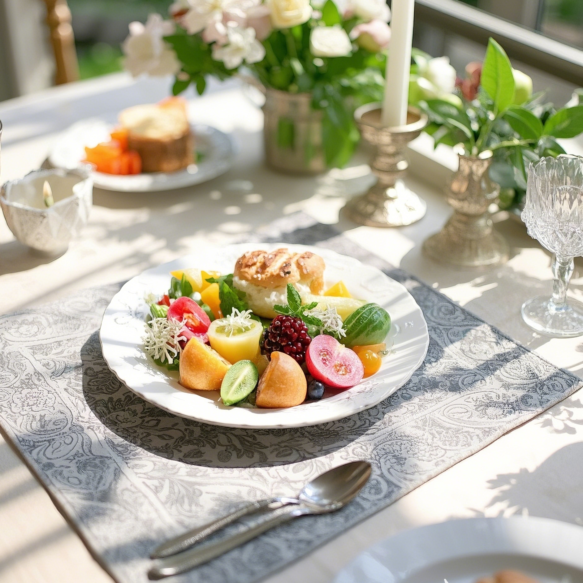
Green: Symbolizes freshness and sustainability, ideal for organic or farm-to-table concepts.
(Image: Sage green napkins with beige tablecloths)
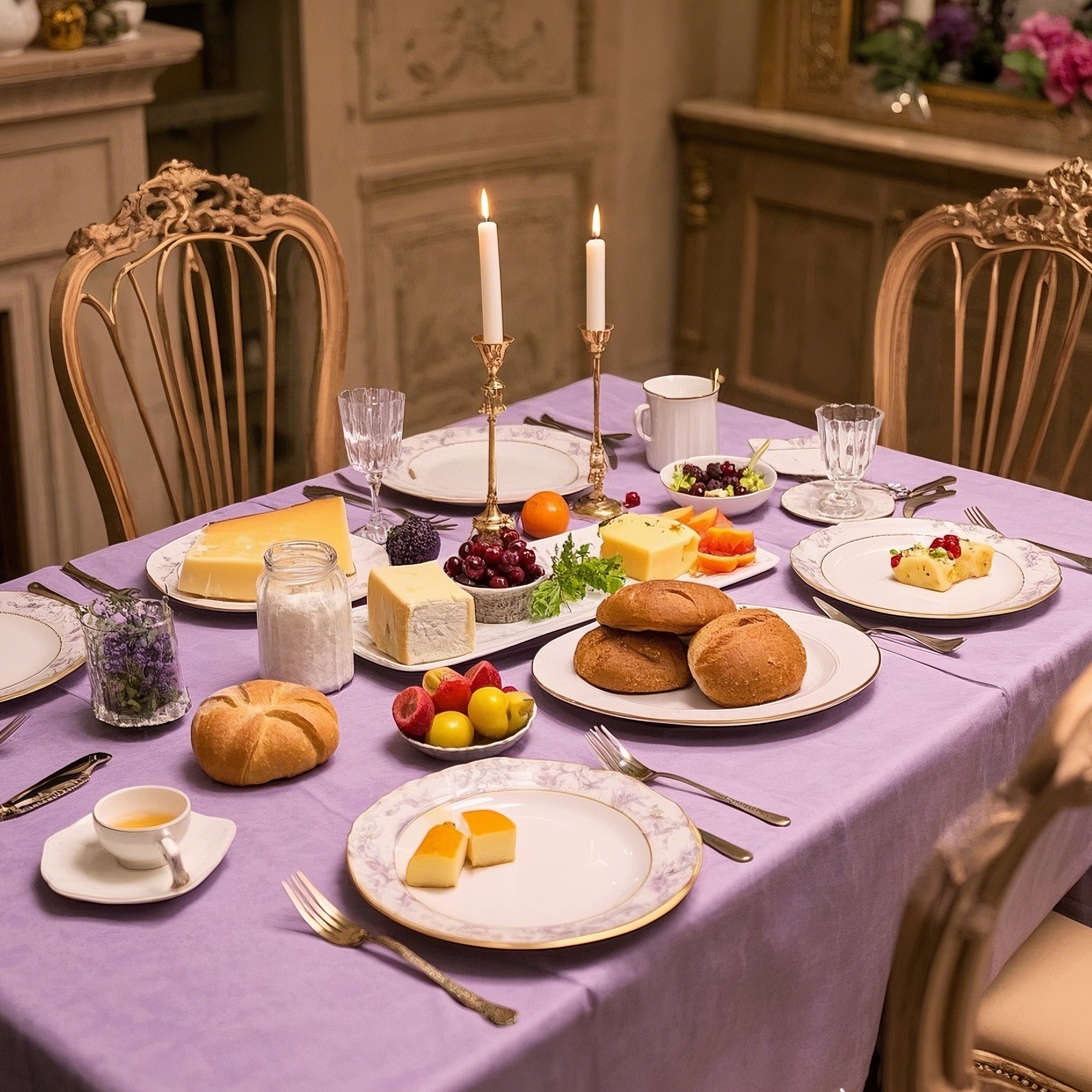
Purple: Associated with luxury and creativity. Deep purples suit fine dining; lavender works for brunch.
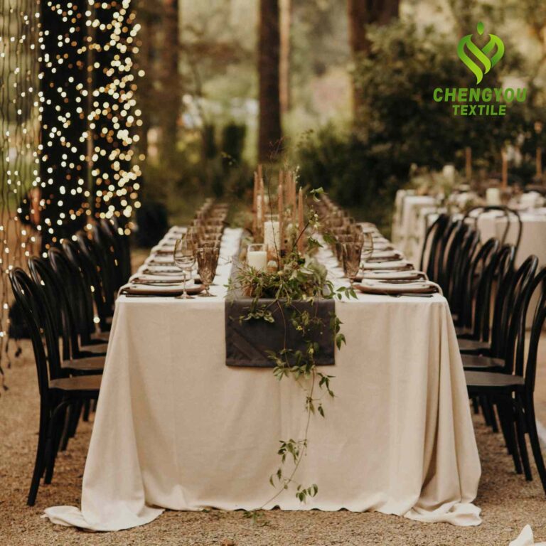
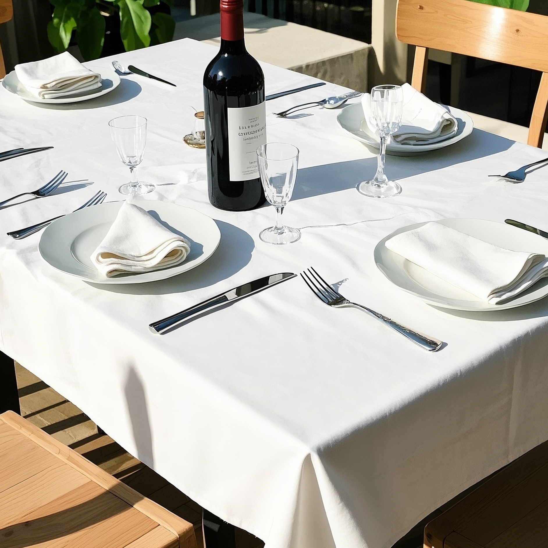
3. Neutrals (White, Beige, Gray, Black)
White: Projects cleanliness and elegance; versatile for high-end or minimalist settings.
Beige/Gray: Timeless and adaptable, allowing food and decor to stand out.
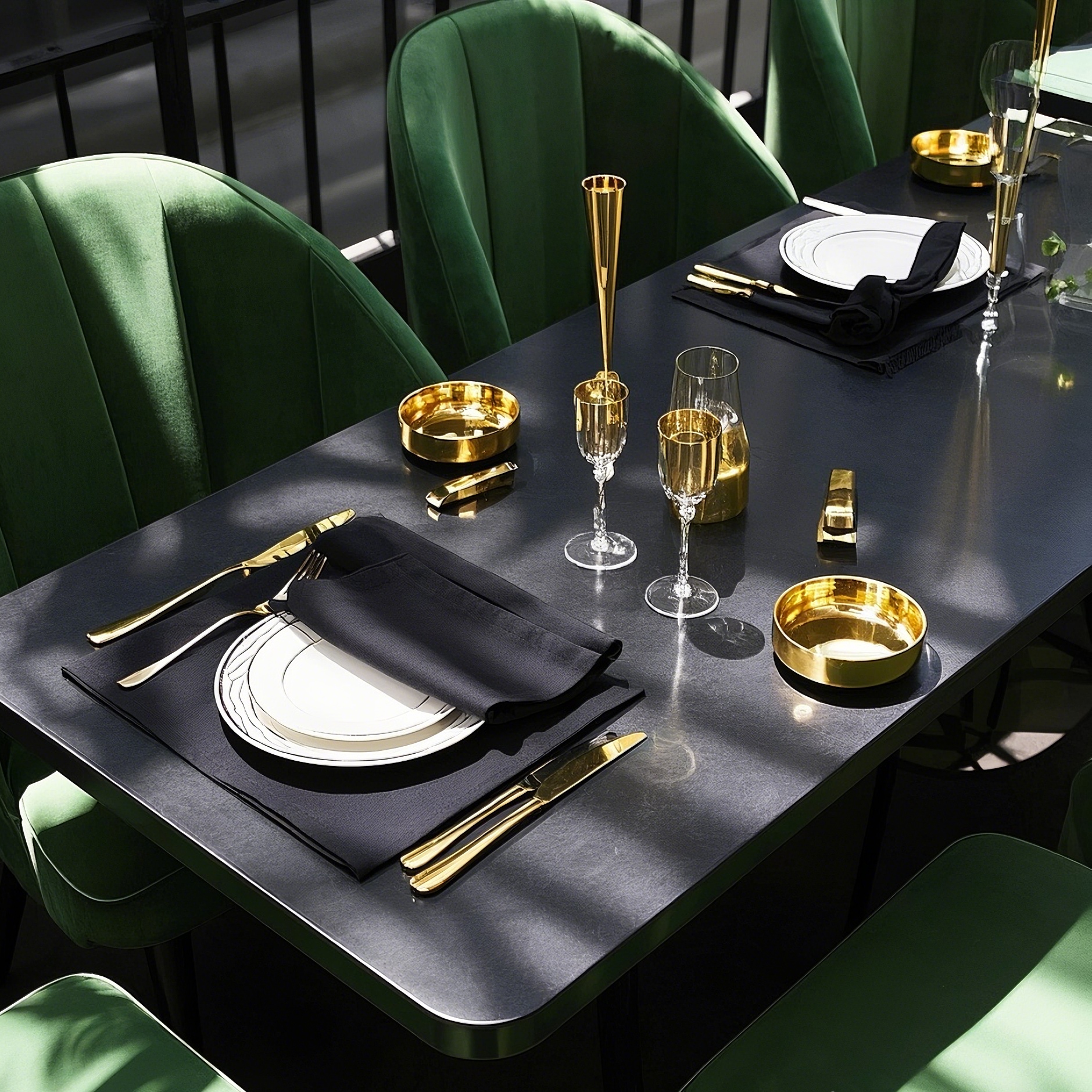
Black: Adds drama and modernity; pairs well with metallic accents for contemporary venues.
CHENGYOU TEXTILE–WHO AM I AND WHAT IS MY MISSION
As a 12 years factory of textile products for event and home decoration, exceed clients expectations by offering superior product and service at every interaction and on every order