A napkin’s colour is decided before the fabric is ever dyed, and most of its problems start there. A colour chosen against a photo on a phone will not match the same shade under restaurant lighting. An accent colour ordered in a small quantity will not match its reorder a season later. Colour in a linen program is a purchasing decision — with rules — and the venues that get it right do so by treating it like the specification it is.
1. Why Colour Is a Purchasing Decision
- Colour commits the whole program. Every napkin in a stack is dyed to match the rest; one off-shade piece is noticeable, and a mixed-batch delivery can ruin a program that was otherwise fine.
- Reorders are harder than first orders. Dye lots vary between runs, so a colour that is easy to order once is only easy to reorder if the match was specified and documented from the start.
- Guests read the table before they read the menu. The colour of the napkin is part of the first impression — it signals formality, freshness, and consistency more directly than most buyers assume.
- Colour choices have cost consequences. Not all colours cost the same to dye, and multi-colour programs multiply the quantity that must be tracked, stored, and re-matched.
2. The Role of Neutrals
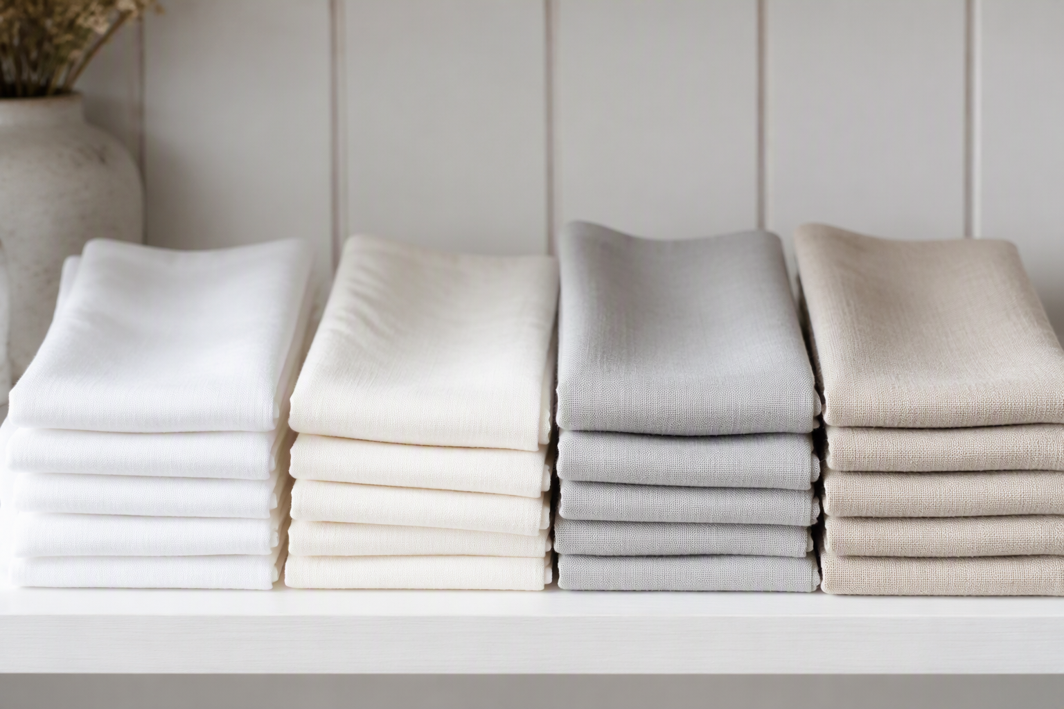
- White: The standard for formal and fine service. It reads clean, matches anything, and signals hygiene — but it shows the most wear, staining, and shade variation, so it demands the tightest control.
- Ivory and oatmeal: Warmer neutrals that read as clean without the clinical edge of pure white. They hide minor age and water marks better, which makes them practical for high-turnover venues.
- Grey (light to mid): A quiet modern base that hides everyday wear well and pairs with almost any accent. A growing standard in contemporary dining.
- Rule of thumb: most programs are built on one dominant neutral (usually 70–90% of the stack) with one or two accents. The neutral carries the program; the accents give it a voice.
3. Choosing Accent Colours
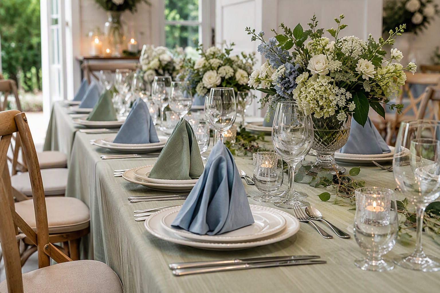
- Match the service style first. Jewel tones (burgundy, forest, navy) suit formal rooms; muted earths (sage, terracotta, ochre) suit modern and rustic styling; bright colours suit casual and celebratory venues.
- Let the room, not the photo, decide. Accents should answer the tablecloth, the chairs, and the lighting already in the venue — a colour that looks right in a showroom can sit wrong on a specific tablecloth.
- One accent per setting. A single accent colour in the napkin (with the tablecloth neutral) is the most reliable composition. Two accents plus a patterned cloth is where tables stop looking designed.
- Seasonal accents are cheaper than you think. Rotating a small accent run each season — while keeping the base neutral constant — refreshes the room without rebuilding the whole program.
- Brand colours need the same discipline as fashion colours. If the napkin carries the brand, specify the exact dye match to the brand standard and approve it against the standard, not against a screen.
4. Coordinating with the Tablecloth and Napkin Set
- Contrast carries the look. The napkin against the tablecloth is the primary colour move on the table — choose the pair with intent rather than assuming “matching” is the goal.
- Same fabric family, different values. A napkin and cloth in the same fabric (e.g. both spun polyester or both linen) in different shades read as one system faster than two different fabrics in one colour.
- Check the whole setting at once. Napkin, cloth, and any runner or placemat should be judged together — a pairing that works alone can fail in the full setting.
- Standardize the program before buying the exceptions. Decide the base cloth, the base napkin, and the accent logic first; special tables can deviate, but the default has to be one answer.
5. Judging Colour Under the Right Light
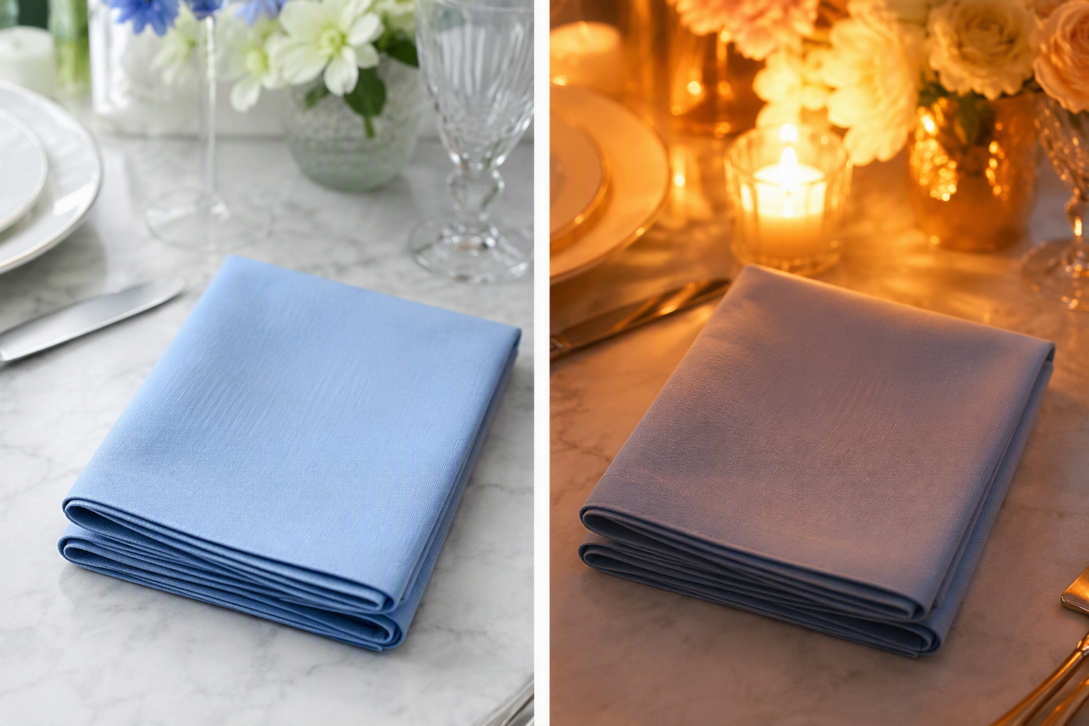
- Approve the sample in the venue’s light. Warm incandescent light pushes colours toward yellow and orange; cool LED pushes them toward grey and blue. The approval should happen where the linen will be used, or under a matched light source.
- Keep the approved sample. A sealed colour sample is the reference for every delivery and reorder — far more useful than a memory or a photo.
- Photographs are for reference, not approval. Screens shift colour enough that approving a napkin from a phone image is how shade complaints start.
- Compare pieces side by side at delivery. Lay new pieces next to stock pieces in the same light — the check takes a minute and catches mixed dye lots before they enter the program.
6. Colourfastness and Ageing
- Ask for wet and light fastness ratings for each colour — the two numbers that predict how the colour will behave in the wash and under the lights over time.
- Dark and saturated colours test harder. They are more likely to show fading and to test dye migration in the first washes; new coloured napkins should be pre-washed before service, exactly as whites are.
- Whites age differently from colours. Whites can grey from detergent residue and yellow from alkaline chemicals; colours fade. Knowing which failure mode a colour is vulnerable to makes the care program more specific.
- Plan a refresh cycle by colour. A colour that fades faster will need replacement sooner — build that into the par and the reorder calendar rather than discovering it at the end of the season.
7. Managing a Multi-Colour Program
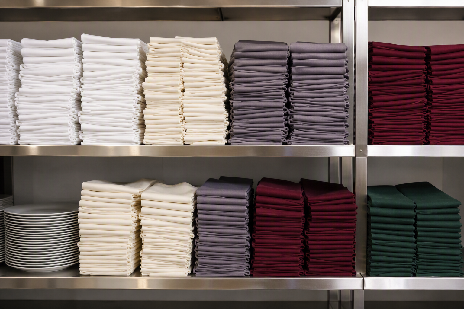
- Stock each colour separately, with its own count. A shared pool always runs out of one colour while the other sits unused; per-colour par is the only workable model for a multi-colour program.
- Keep dye lot codes per colour. Reorders should request the same lot or a matched lot; the code belongs in the stock record next to the colour name.
- Store colours apart from light and from each other’s laundry runs. Long UV exposure fades colour, and mixing heavy dyes with whites in the first washes is how off-shade stock gets created.
- Reorder accents on a calendar, not an emergency. Seasonal and accent runs take production time; ordering them mid-season is how venues end up with the wrong shade or no shade at all.
8. Napkin Colour FAQs
Is white still the standard for restaurants?
White remains the default for formal and fine service because it reads as the cleanest and most neutral option. Many venues now pair a warm neutral (ivory or grey) for high-turnover areas where whites show wear faster.
How do I make sure a reorder matches the original colour?
Specify the match to a sealed sample or a documented colour standard, request a matched dye lot, and compare the new delivery side by side with stock pieces in the same light before accepting.
How many colours should a program have?
One dominant neutral plus one or two accents is the reliable range. More than that and the tracking, storage, and reorder matching multiply — the look rarely justifies the complexity.
Can I use the same napkin colour across different venues?
Yes — and it helps if the light and tablecloth match too. Where the rooms differ, the same dye can read differently, so approve the colour in each environment before committing both venues to it.
Final Thoughts
Choosing napkin colours is less about taste and more about control: pick a neutral backbone, add a deliberate accent, approve the colour under the light the table will actually see, and manage each colour with its own count, lot code, and reorder calendar. Do that, and the programme stays consistent not for one season, but for the whole life of the stock.
We dye napkins to exact colour standards — with sealed samples, dye-lot matching on reorders, and wet and light fastness ratings provided per colour. Contact us for colour swatches, fastness data, MOQs, and wholesale pricing.