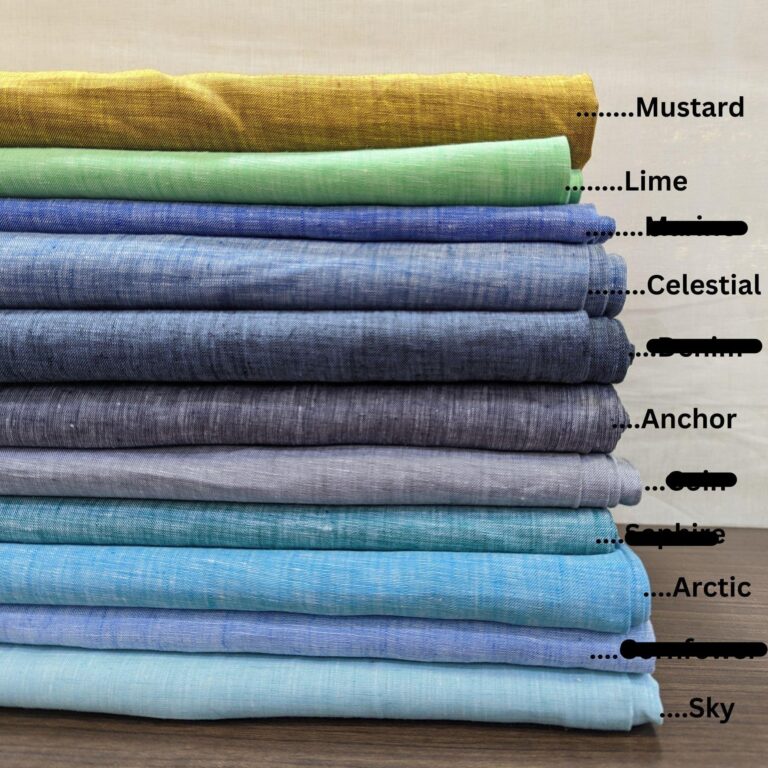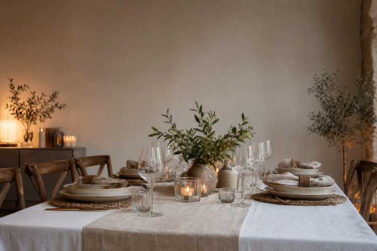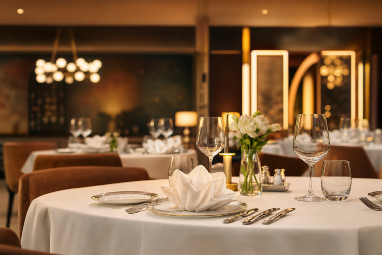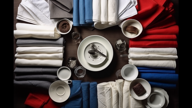
A tablecloth is the largest single area of colour in most dining rooms — bigger than the wall paint, bigger than the napkins, bigger than anything a guest actually notices first. That is why colour on table linen is a program decision, not a style choice. A colour program that is planned holds the venue together across seasons; one that is not, drifts lot by lot, season by season, until the front of the house looks like a swatch shelf. This guide is about building that program: the three layers it should have, how to choose the core neutrals, how to match the full table, how to judge every colour in your own light, and how to order and re-order so the colour holds.
1. Why Colour Is a Program Decision, Not a Style Choice
- The tablecloth carries the largest colour surface in the room. A wrong napkin colour is a per-seat fault; a wrong tablecloth colour is a whole-table fault, repeated at every table at once.
- A lot mismatch shows across the room. Two tablecloths from two dye lots, one a shade off, read as dirt at the first table and as a fault at the sixth. On the largest colour surface in the room, the lot is the colour.
- It sets the tone for the whole table program. The napkins, runners, overlays and chair covers are all read against the tablecloth. Get the tablecloth colour decision right and the rest of the program becomes easier; get it wrong and nothing on the table can fix it.
- It is the costliest colour to change. A napkin colour is a small re-order; a tablecloth colour is a par-sized re-order across every table. The colour decision deserves the same planning depth as the par decision.
2. The Three Layers of a Tablecloth Colour Program
- The core: high-depth neutrals. The workhorses that dress the room every day — whites, ivories, beiges, greys, and a deep base. They carry the deepest par, they are lot-matched the most strictly, and they are the colour a guest associates with the venue.
- The accent: mid-depth colours. The zone or brand colours — a deep green for the bar, a charcoal for the private room, a seasonal neutral for the garden area. Shallower par than the core, but still working cloth, and still lot-matched within the colour.
- The seasonal tier: low-depth, high-visibility colours. The holiday and event colours — burgundy and emerald for the season, a themed colour for a function. Shallow par, planned lead time, and a deliberate swap rather than an accumulation.
Depth follows visibility. The core sees every service and needs the most cloth; the seasonal tier sees a window and needs a planned, shallow depth that comes in and out of the program on schedule. Most colour problems on the floor are really depth problems in disguise — a colour that was under-bought for the role it was given.
3. Choosing the Core Neutrals
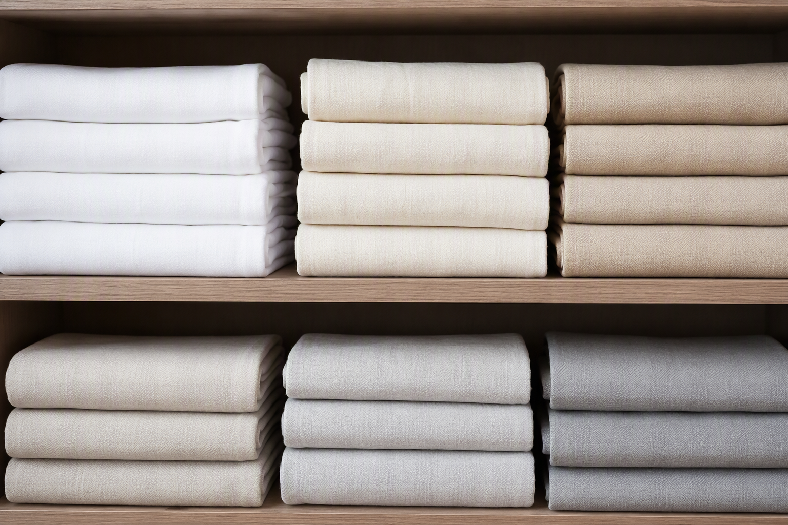
- White and ivory: the classic core, and the honest one. They read clean, they suit any program, and they show wear — a soiled white tablecloth announces itself, which is exactly what you want a core to do on a short notice. The trade is a higher care standard and a tighter lot discipline.
- Beige and taupe: the hide-wear core. The forgiving neutrals for high-turnover casual service — they take a day’s wear and still read clean, and they ground a room that needs warmth. The trade is that they shift noticeably with the light and age unevenly if the lot is off.
- Grey: the versatile middle. Light grey works where white is too formal and beige too warm; charcoal works where black is too heavy. Grey is the colour that makes the accent layers read, because it sits between them and the guest.
- Black and deep colours: the formal base. The strongest read in the program, the hardest to keep clean of dust, lint and rings, and the one that makes napkin and runner colours pop. A deep base is a style statement with a care standard to match.
- The rule is one dominant core, chosen for the service, not the palette. A fine-dining room and a café do not need the same core, and a venue that tries to run three “equal” cores will find its front of house drifting. Pick the core the service demands, and let the accents do the rest.
4. Matching the Full Program
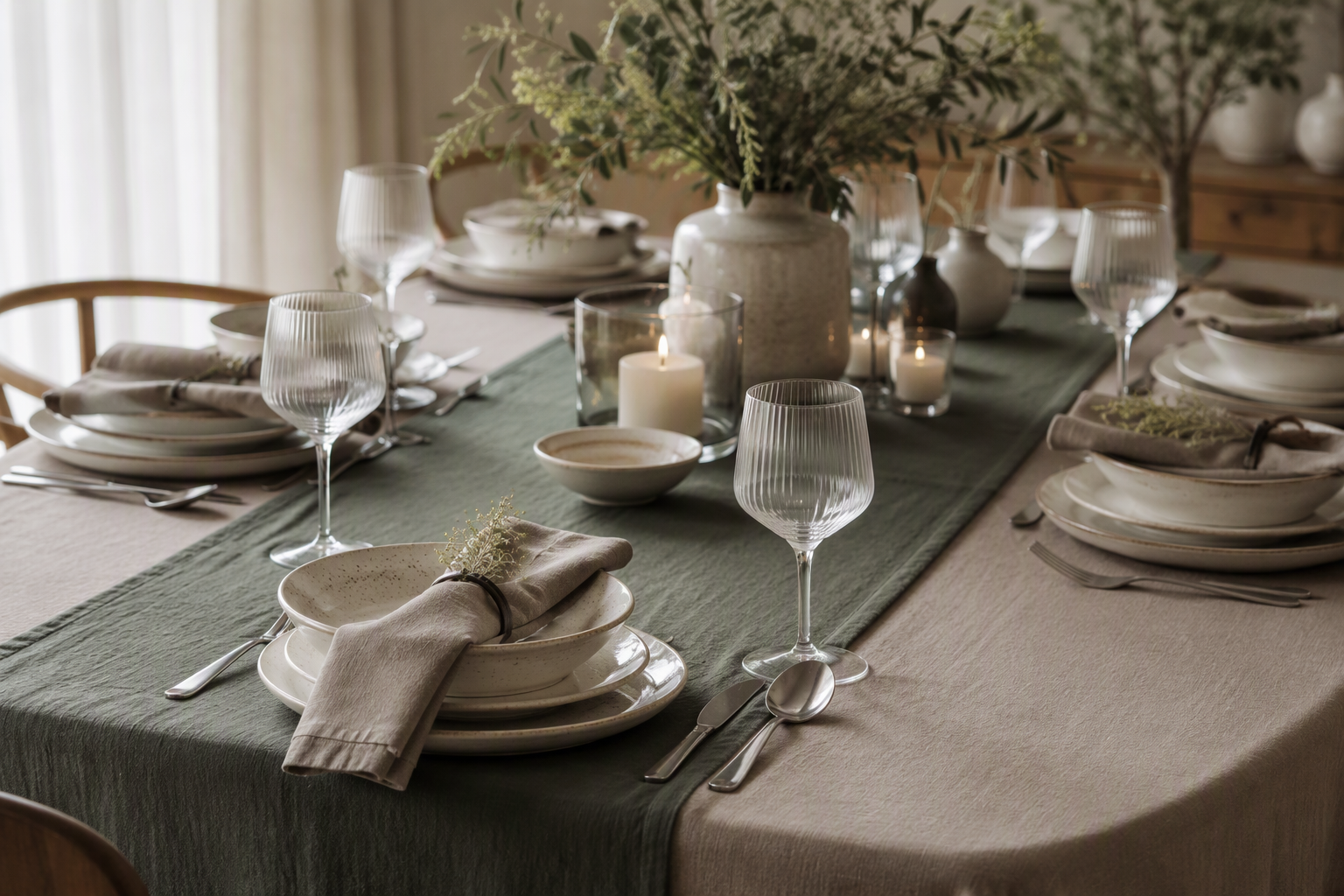
- One dominant, one accent — the tablecloth leads. The tablecloth is the dominant colour; the napkins, runner and chair covers are read against it. A matched program has one colour doing the heavy lifting and the others supporting it, not four colours each trying to.
- Tonal or contrast — a decision, not an accident. Tonal matching (the tablecloth and napkins in the same family) reads calm and lets the runner carry the accent; contrast (a deep napkin on a light cloth, or a light napkin on a deep cloth) reads sharp and styled. Choose the read you want and hold it across the room.
- The runner is the accent’s home. When a program is not ready for a full colour change, the runner is where the accent lives — one deep colour down the middle of a neutral table is the cheapest and safest way to shift a room’s tone.
- Check the chair cover last, because it is the one that is hardest to change. Tablecloth and napkin are in rotation; the chair cover often is not. A chair colour that fights the core will outlast the core and be the reason the next change is awkward.
5. The Light Is the Judge
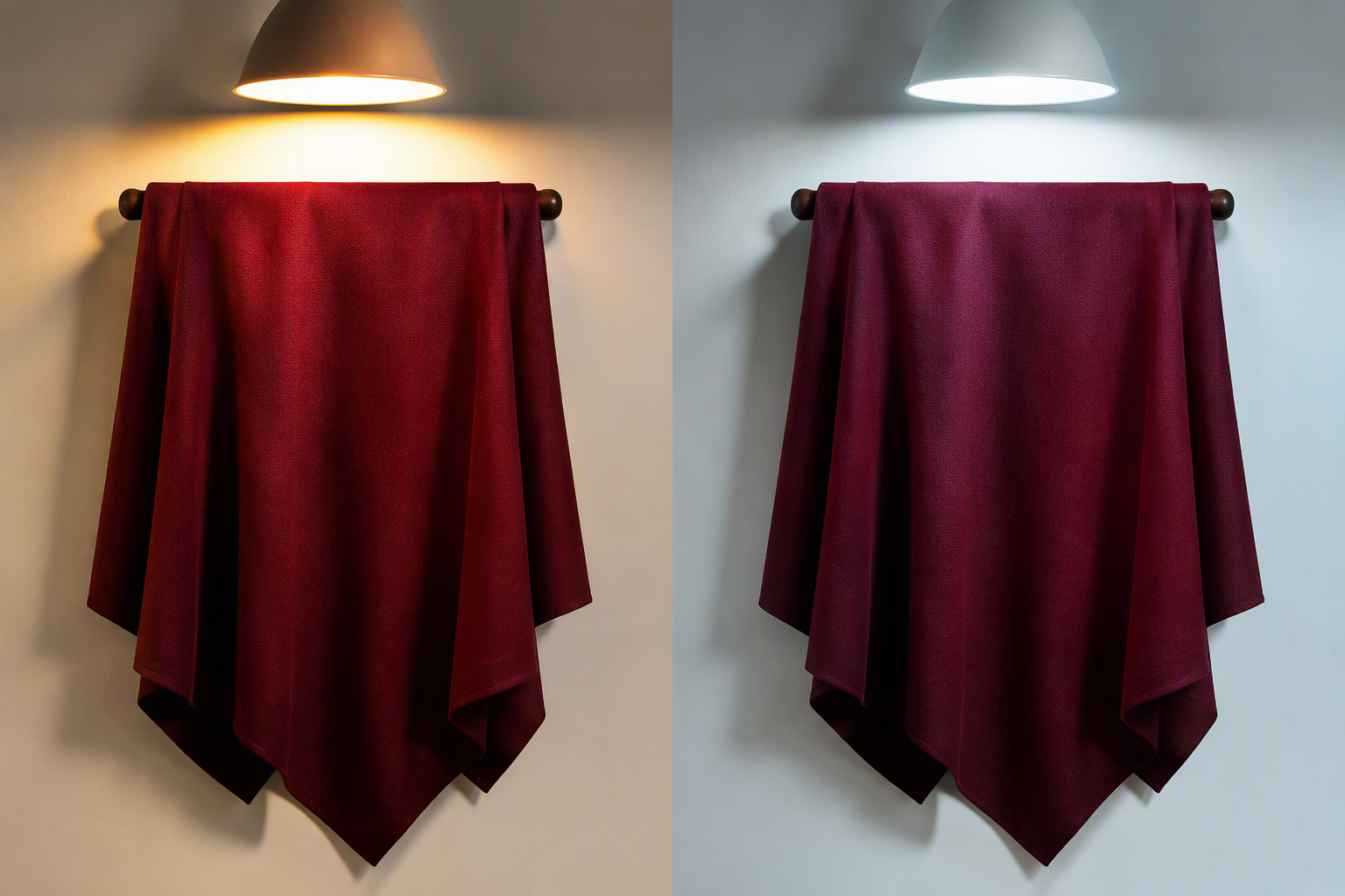
- Every colour you buy will be read in your light, not the factory’s. A beige that is warm in daylight can read pink under 3000K lamps and grey under 4000K. The venue light is the only colour reference that matters, and the swatch is a starting point, not a verdict.
- Test the approved lot in the room before the full order. The finished cloth, not a swatch — laid on the actual table, in the actual light, at the actual time of day you serve. A colour that works at noon can fail at dinner, and the dinner hour is the one you are dressing.
- Watch for the two-tone effect on textured and deep fabrics. On velvet and other light-absorbing weaves, the same colour reads deeper in the dip of the fabric and lighter on the crest — a colour that looks right flat can read muddy in the weave. The deep colours in particular need the in-place test.
- Keep a light-matched reference with the program. The approved finished sample, stored in the room’s light, is what every re-order is judged against. Without it, “the same colour” is a memory, and memories of colour are how programs drift.
6. Colour and Fabric — the Same Colour, a Different Read
- Matte and sheen change the read of one dye. A sateen or satin cloth in a deep colour reads richer and darker than the same colour on a matte weave, because the sheen concentrates the light. Choose the fabric before you lock the colour, not after.
- Linen-look and plain-weave read cooler and calmer. The same neutral on a textured, open weave reads more natural and a touch lighter than on a dense smooth cloth — the weave scatters the light the sheen would concentrate.
- Deep colours live in heavy, light-absorbing fabrics. Velvet and taffeta carry a deep colour with a weight and a depth that a light plain-weave cannot — which is why the seasonal and formal tiers skew to the heavier weaves, and the everyday core to the matte workhorses.
- Match the colour story to the fabric story. A program that is tonal and calm usually sits on matte, natural-feel weaves; one that is sharp and styled usually uses a sheen or a deep, light-absorbing cloth. The fabric and the colour are one decision, and they should be made together.
7. Colourfastness and Consistency
- Wet and rub fastness, in writing. A tablecloth colour is judged on what it does in the wash and under the friction of service. The fastness figures are the difference between a colour that holds for two hundred washes and one that grays by the fortieth — the same failure a cheap program shows on the edge.
- Lot-to-lot consistency is the real spec. Two lots of “the same” colour are the standing risk of every program. The dye lot is recorded, the approved sample is kept, and the re-order is judged against the sample in the room’s light — not against a screen or a memory.
- Uneven colour within a cloth is a build fault, not a dye fault. A cloth that is a shade off across the fold or the hem is a dyeing or finishing problem that no care program will fix. It is the colour version of the cheap-runner failure, and it is what you are checking when you look at the finished cloth in the light.
- The colour you approve is the colour you hold the lot to. The approved finished sample, the fastness figures, and the lot code are one document — the three together are what “the same colour, every time” actually means on a purchase order.
8. Ordering by Colour
- Approve a finished sample, not just a swatch. The swatch sets the colour; the finished cloth, in the fabric and the size, in the room’s light, sets the program. Both should be approved, and the finished cloth is the one that carries the decision.
- State the tolerance. The colour tolerance for the order — how far a lot may drift from the approved sample — should be in writing, so a shade-off cloth is a defect you can reject, not a surprise you absorb at the unload.
- Keep a room’s core in one lot. The core of a dining room should come from a single dye lot, so the whole room reads as one colour. Splitting a room across lots is how a matched front of house becomes a swatch shelf.
- Plan the re-order as a lot-matched top-up. A re-order is judged against the stored sample in the room’s light, in the same fabric and finish, at a depth that tops up the par without over-buying the colour. The par math and the colour math are the same decision.
- Stage the program by zone and by layer. The core in one lot-matched run, the accent by zone, the seasonal tier in its own labelled lot — a colour program that is staged well is the one that comes off the shelf in the right colour every time.
9. Seasonal Rotation
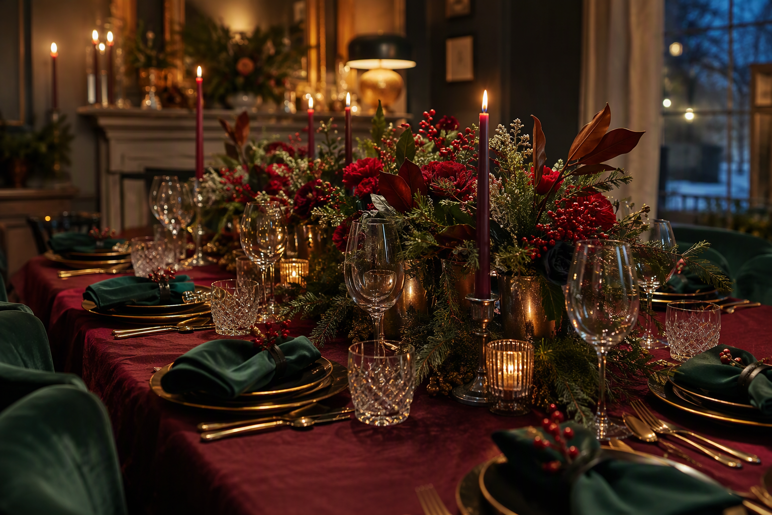
- Change the tier, not the core. A seasonal shift is done by swapping the accent and the seasonal layers — the runner, the napkins, a deep tablecloth for the event tables — while the core neutrals hold the room. The room changes tone without the program being torn up.
- Bring the seasonal tier in on schedule. A planned, shallow depth of the seasonal colour, ordered with the lead time the season needs, is the difference between a room that is ready for the season and one that is still waiting for the lot.
- Mix the seasonal cloth through the core, not all at once. A full seasonal swap at once is a visible event; staging the deep colour through the room across a few services is the same look with none of the changeover.
- Store the seasonal tier in its own lot, by colour. The holiday colour that is stored with the core gets folded into the wrong shelf and comes out in the wrong season. Labelled by colour and by lot, the tier comes back set, matched, and ready.
10. Tablecloth Colour FAQs
White or ivory for an everyday core?
White reads clean and crisp and suits a program that presses daily and turns the cloth fast; ivory is a touch warmer and a touch more forgiving of the light, and it reads better in a room with warmth in it. The honest answer is that either can carry a core — the decision is the care standard and the lot discipline you are willing to run with the colour, not the shade itself.
Can I run two core colours in different zones?
Yes — a zone colour is a normal part of a program, as long as each zone’s core is lot-matched within itself and the two cores are a deliberate contrast, not an accident. The fault is running two “equal” cores in the same visual field, where the mismatch reads as drift instead of design.
How do I keep a re-order the same colour as the original lot?
By judging it against the stored approved sample, in the room’s light, in the same fabric and finish — and by recording the dye lot of the original so the re-order can be matched to it. A screen, a memory, or a swatch kept in the office are all references that have already started to drift; the finished sample in the room’s light is the only one that holds.
For a season, is changing the accents enough, or do I need new tablecloths?
Usually the accents are enough — the runner, the napkins, and a shallow depth of a deep tablecloth for the event tables will shift the room’s tone while the core holds. New tablecloths for the season are a decision about the core itself, and they are worth making only when the season is the venue’s identity for the window, not just its decoration.
Final Thoughts
A tablecloth is the largest colour in the room, and the colour decision is the one a guest reads before anything else on the table. Build it as a program: a lot-matched core at the depth the service needs, an accent that does the styling, and a seasonal tier that comes and goes on schedule. Judge every colour in the room’s light on the finished cloth, put the fastness and the tolerance in writing, and hold every re-order to the stored sample. Done that way, the front of house reads as one colour story, season after season — instead of a swatch shelf that drifts a little further every order.
We supply tablecloths in a full colour program — the core neutrals, the accent deeps and the seasonal tier, in the fabric and size your room needs, with the dye lot, colourfastness and tolerance recorded on the order and a finished sample approved in your light before the full run. Contact us for colour swatches, samples, sizing, MOQs, and wholesale pricing.